I OPENED A SMALL BUSINESS!

I’m excited to announce that I have, yet again, another NEW WEBSITE!! But this time, it’s for something a little different.

My “Circle of Friends” project got more attention than I anticipated. It started with me making an icon of my own face & ended with friends asking me to make icons of their faces. Things also started happening when I made icons of my favorite band (Paramore)’s faces. It ended with fans asking me to put them on pins & stickers. So, to fulfill everyone’s requests, I opened up a shop just in time for the holidays!! https://crisannefernandez.bigcartel.com/

YOU CAN NOW PURCHASE:
• A CUSTOM ICON DESIGN • Paramore’s After Laughter (1”) Pin Set • A CUSTOM ICON DESIGN + 10 (1”) PINS
• Paramore’s After Laughter (2.5”) Sticker Set • A CUSTOM ICON DESIGN + 10 (2.5”) STICKERS

DESIGN INSPIRATION IN NEW YORK POP-UPS

I work full-time in Washington, DC, but I often visit home in New York City. Of course, I visit for friends & family. However, another big reason I do so is for pop-up art exhibits! Pop-up art exhibits have been my favorite places to get design inspiration since I started college. My very first one was the famous, “Infinity Room” by Yayoi Kusama. I fell in love & now, my mission is to go to as many New York City pop-ups as I can. Here are some of my favorites that I’ve gone to recently!


Dream Machine

LittleRainCloud.jpg
HLB-2.jpg
HLB-4.jpg
HLB-1.jpg
HLB-5.jpg
ballpit.jpg

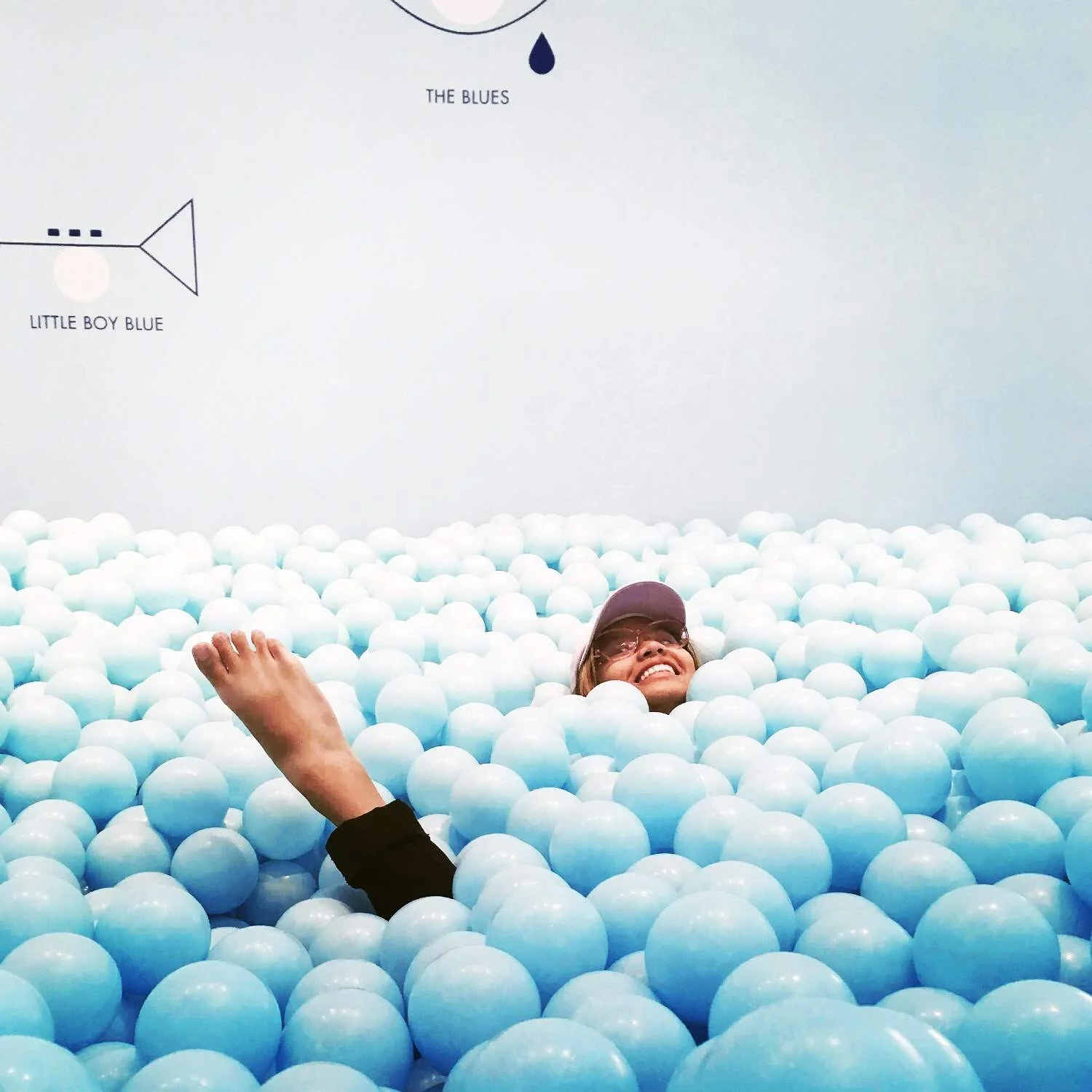
So many exhibits have been following the classic ball pit trend, but that’s totally understandable because ball pits are just so much fun! Dream Machine’s pit was small, but deep. It might have been the deepest pit I’ve ever jumped into! The walls surrounding the pit were also very interesting. They had a ladder on the corner & emitted reflections of water, giving off the illusion that the pit was deep inside a pool.

Dream Machine also flaunted other interesting things, such as a hallway of changing colors, a room of lights & floating clouds, & so much more.


Color Factory

colorfactory2.jpg
bitter-cake-febdf1.jpg
IMG_2178.JPG
IMG_2246.JPG

While Dream Machine’s ball pit was the deepest I’ve ever jumped into, Color Factory’s ball pit was the biggest I’ve ever jumped into! The sky blue pastel color made me feel like I was playing in clouds.


Not only did Color Factory give us spaces to make our eyes visually pleased, but it also gave us free desserts and so many fun activities to partake in. We got one mochi, macaroon, candy, and ice cream. We also got to take a free colored pin of our choice. We walked through a colorful hallway, played instruments, picked a partner and drew them without looking, threw beach balls, took a quiz and received a secret color based on our answers, danced, spun on a color wheel, and of course… played in the ball pit. There was a photo station in each room, ensuring that every moment was captured and sent to our emails. The interactivity of this exhibit was definitely on another level which is why Color Factory is now my favorite!

& there you have it, folks. These are some pop-up exhibits that I’ve been to recently. Thanks to them, my love for color & fun has been reignited. Many more to come!

NEW SEASON, NEW BLOG

SocialSharingIcon.jpg

It’s the first few days of fall & I decided to extend my creative space even further! I finally published a NEW blog specifically for my travel photos & documentations. I wanted my (new) site to dive deeper into the life-changing trips I’ve had while this (old) site dives deeper into my design work & inspirations. You can check out my new blog here! https://crisannewentthere.com/

THE CREATION STORY + GRAPHIC DESIGN

10.jpg

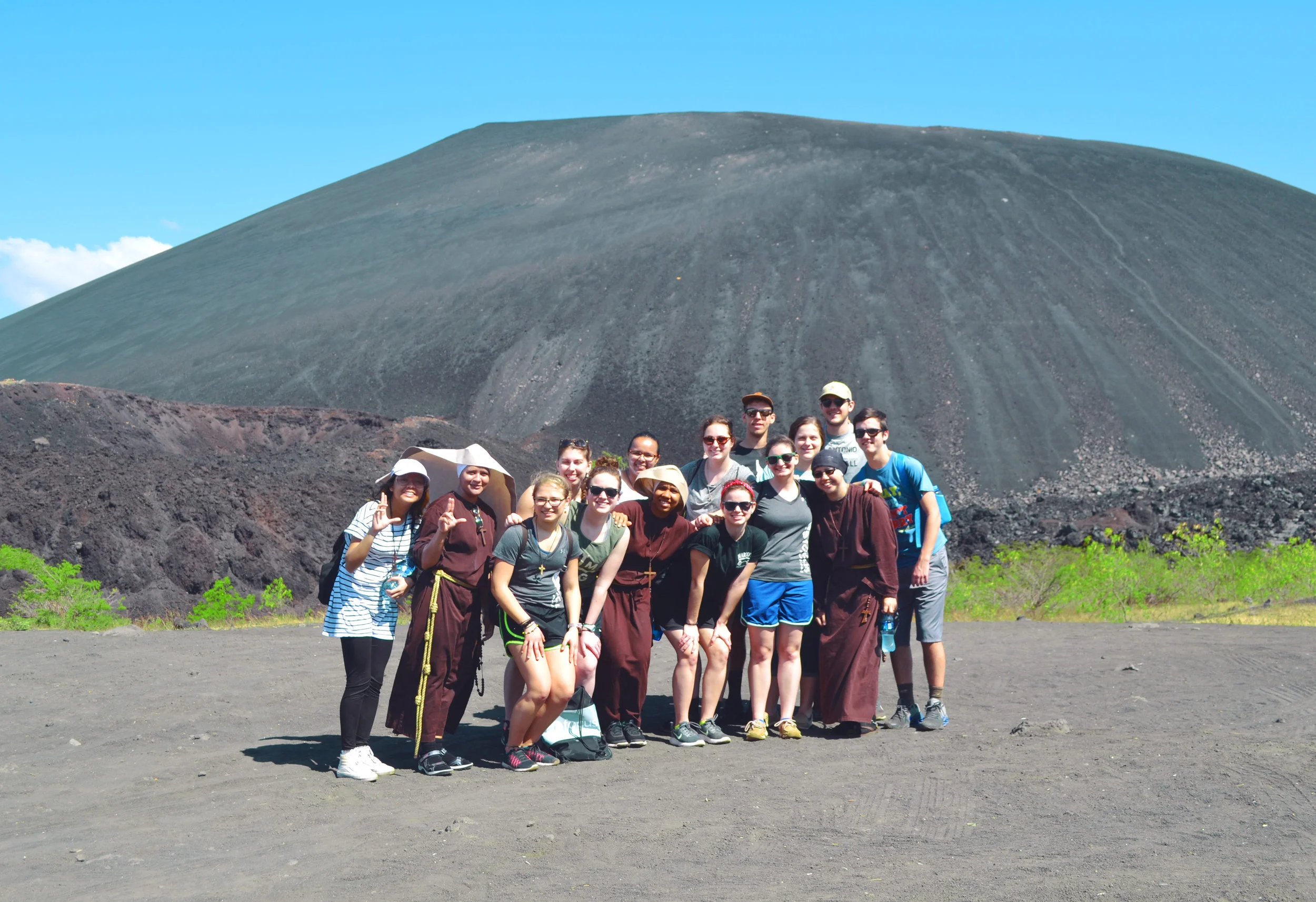
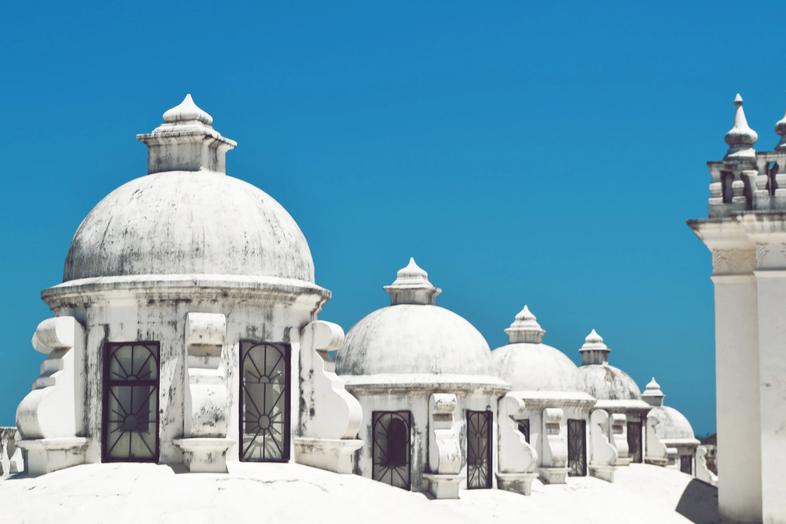
I have so many things to reflect upon after my FOCUS mission trip to Nicaragua, especially the ways that God is real in my life.

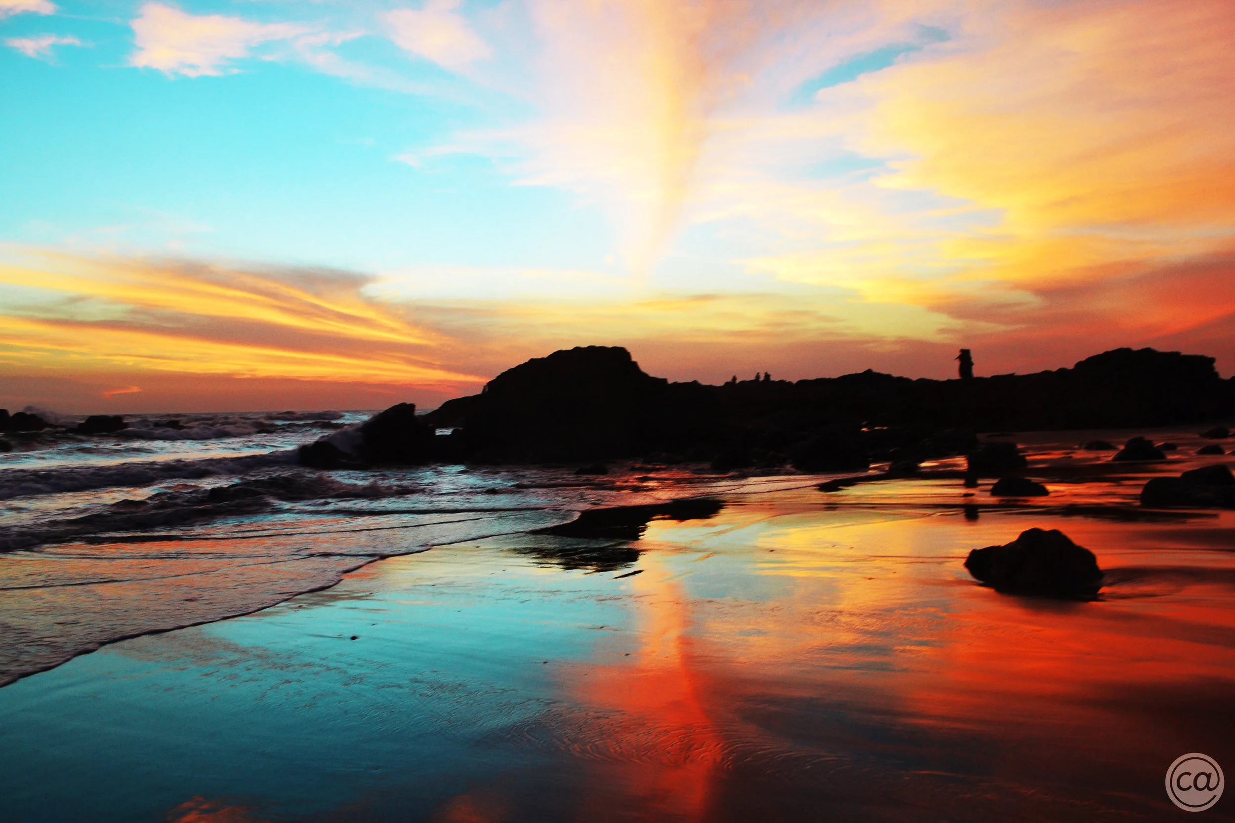
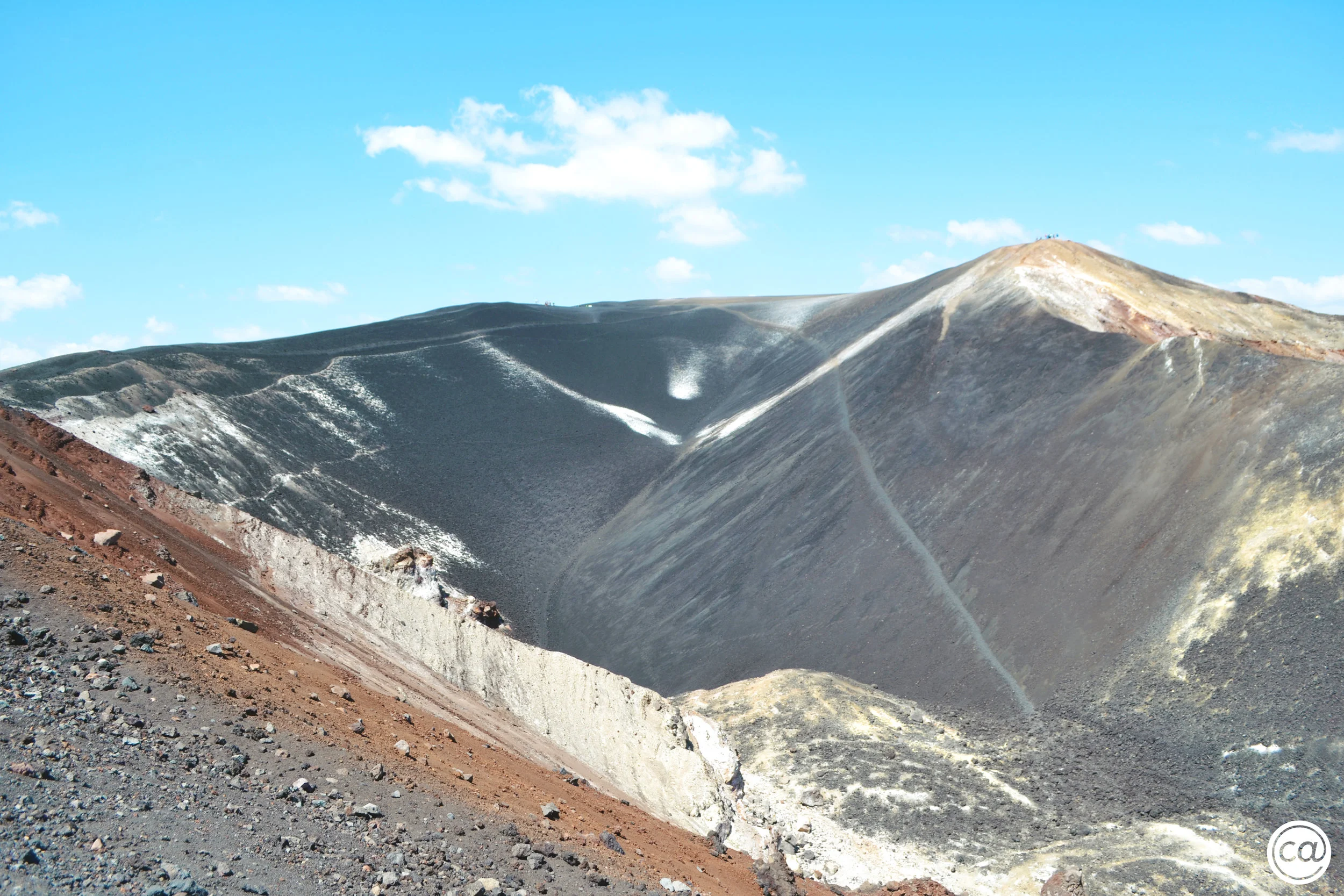
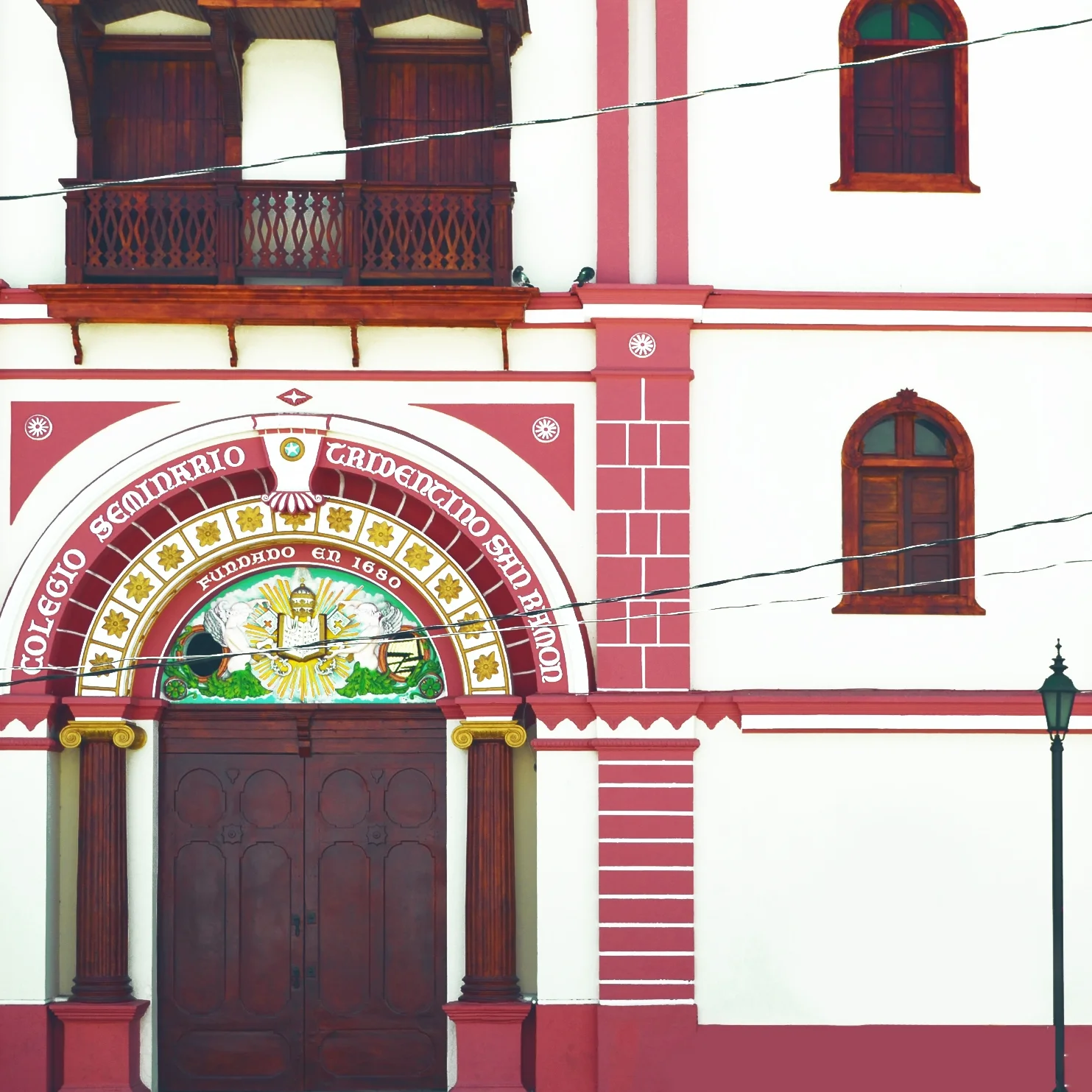
These photos are only a few of many. I posted these in particular because they were my God Moments. God Moments are times where I thought, "Wow! God is ABSOLUTELY real & He is the greatest artist of all time." This thought reminded me of The Creation Story and The Creation Story reminded me of graphic design.

God didn't just throw together random things, hoping they would look good together. Instead, He created with intent, worked on every little detail, & gave each little detail a purpose. The details became parts of bigger masterpieces. The sun, moon, day, night, mountains, humans, etc. are only some of the masterpieces I'm talking about. These masterpieces left us in awe & wonder. They gave us life. God didn't just decorate... He designed

A common misconception about graphic designers is this: our job is to just doodle or make things look good. No. Graphic design is all about creating with intent, working on every little detail, & giving each little detail a purpose. The details become parts of bigger masterpieces. Branding, functionality, user interfaces, user experiences, etc. are only some of the masterpieces I'm talking about. If we're lucky... these masterpieces will leave people in awe & wonder. If we're lucky... they will give us life. Graphic designers don't just decorate... they design. Do you see the similarities now?

Graphic design may not be as miraculous as The Creation Story, but I'd like to believe it could be. This is why I choose graphic design. It's a reminder of my ABSOLUTELY real God & Him as the greatest artist of all time. It's my way of imitating Him, giving back to Him, & glorifying Him.

#HOMwork Challenge 3, 4, & 5: REPHRASE & REDRAW

#HOMWORK CHALLENGE 5

#HOMWORK CHALLENGE 5

#HOMWORK CHALLENGE 3

#HOMWORK CHALLENGE 3

#HOMWORK CHALLENGE 4

#HOMWORK CHALLENGE 4

CHALLENGES OF THE PAST FEW WEEKS:
#3: Choose an overly hand lettered, cliche phrase. Customize & hand letter it. I took the phrase "Work Hard, Play Hard" & customized it to "Work Hard, Pray Harder." I re-did this about 2 times because this phrase is so important to me & I wanted it to be perfect. What I learned this week was a re-enforcement of what I learned the week before: nothing will ever be perfect, so might as well post it.

#4: Choose a letter in the alphabet & draw it in 16 different styles. The page will then serve as a "cheat sheet" for future designs. I learned that we're bound to repeat the same ideas or run out of ideas. But... getting online inspiration should still always be the last resort! For creativity, look within. It's always there! So believe in yourself!

#5: Similar to #3. Choose an overly hand lettered, cliche VALENTINE'S DAY phrase. Customize & hand letter it. This year, Valentine's Day & Ash Wednesday are on the same year. Conveniently at USCCB (my job), we've been brainstorming creative ways to say that. The phrase I hand lettered was thought of by my coworker. I learned that people have phrase fatigue – a numbness to overly used phrases. So if you continue to hand letter those phrases, your audience will be BORED. So change it up, create something REFRESHING, & express your unique personality. Through this, your work will SHINE!

I have to admit. These challenges are super difficult & I haven't been proud of anything I've created in a while. That's why I haven't been posting as frequently. But, the one I made for Challenge #5 is something I'm happy with!


#HOMwork Challenge 2: AFTER 3 YEARS OF PRACTICE

These are hand lettering pieces inspired by something I read in the Magnificat. "Delight to remember that nothing should ever take us by surprise, except the wonder of God's plan." 

THIS WEEK'S CHALLENGE: Find a hand lettering piece you made at least a year ago & recreate it. Afterwards, write about what you knew then vs. what you know now.

Here we go! The top image was done in January 2018. The bottom left image was done in January 2015. So here's what three years of practice looks like. What a difference! Time to roast my past self... (hehe). Then: I didn't have an understanding of typography hierarchy. I didn't write cursive well. I didn't know when to draw thin & thick lines. Now: I have a better understanding of what words to emphasize. I write cursive much better. I'm considerate of how a calligraphy pen writes & I use that to determine which lines to draw thin & which lines to draw thick.

Back when I posted the January 2015 piece, ironically, I got compliments on it. But I know today that I still have a lot to work on. This just goes to show that Lauren's spiel this week was right. Your work will never be perfect, so might as well post it. If you don't take a risk & post it, you'll never know who will appreciate it. Looking forward to next week's challenge!

Behind the Final Design: #HOMwork CHALLENGE 1

Inside is a time lapse video & initial sketch of the "Me in a Nutshell" piece that I designed for #HOMwork Hand Lettering Challenge. Check it out to see how gross it used to be... lol just (half) kidding! Check it out to see how it looked before the digital edit. The writing utensils I used were: #2 mechanical pencil, Micron pens (sizes 03, 04, & 08), & a Sharpie marker. 

Read More

#HOMwork Challenge 1: ME IN A NUTSHELL

CrisAnne-Favorites.jpg

One of my new years resolutions is to improve on my hand lettering skills. That's why I decided to participate in the #HOMwork Hand Lettering Challenge! It's a FREE design challenge created by my favorite hand letterer, Lauren Hom. Each week, she will send an email to her subscribers including: an assignment with a unique subject to hand letter, a guide on how to do it successfully, & something motivational.
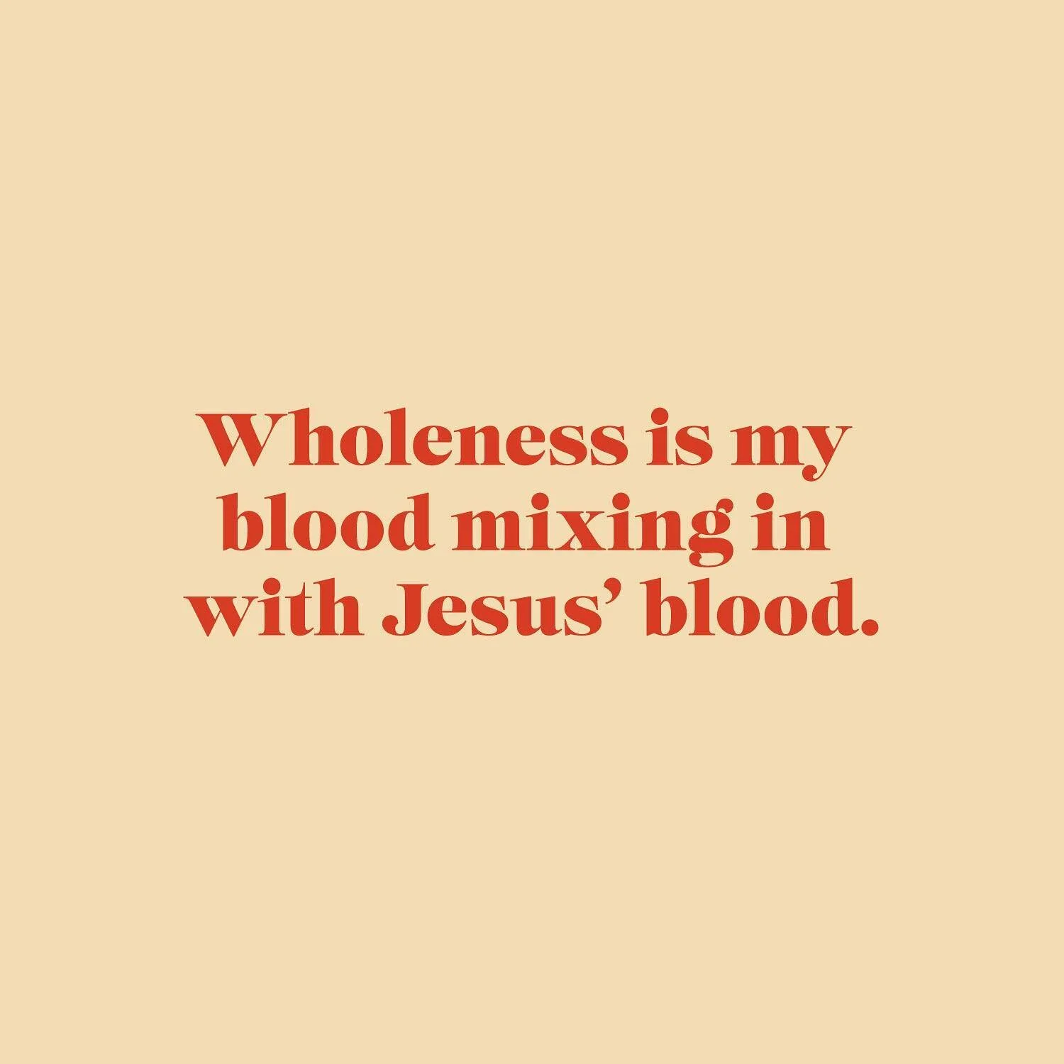
THIS WEEK'S CHALLENGE: Letter your name surrounded by your favorite things.

This week, Lauren sent us a time lapse video of her hand lettering this assignment. She also talked about how our favorite things truly shape our work & who we are. It's very important to figure out what wakes us up in the morning, what brings us enthusiasm, & what gives us purpose. As you can see, for me, some of those things are: the Catholic faith, purple, Paramore, & New York City. That explains why I work at USCCB, have a purple-filled portfolio, use Paramore as the subject of some illustrations, & thrive in busy-ness. Makes sense!

Graphic Dump: USSCB MASS READINGS

You know your job is wonderful when you get to reflect on mass readings & design graphics for them. These are a few that I'm satisfied with. Some are just drafts & some were actually published.

I designed these for USCCB's social media platforms. I hand–lettered the script & bold type with micron pens. I'm not as good at hand–lettering as I dream of, but doing this weekly is definitely great practice!